December 5, 2011

Summative Statement

My research project started with America’s Pop Art artist Edward Ruscha. He grew up in Oklahoma City and later on moved to California in 1956, which had many influences on Ruscha’s most famous works such as Hollywood and the Large Trademark with Eight Spotlights, also known as the twentieth century fox logo. He attended the Chouinard Art Institute and joined the Ferus Gallery group, where he filmed the movie The Cool School. Not only did Ruscha work with painting, printmaking, and drawing, but he also worked with photography and film as well. (Reference)
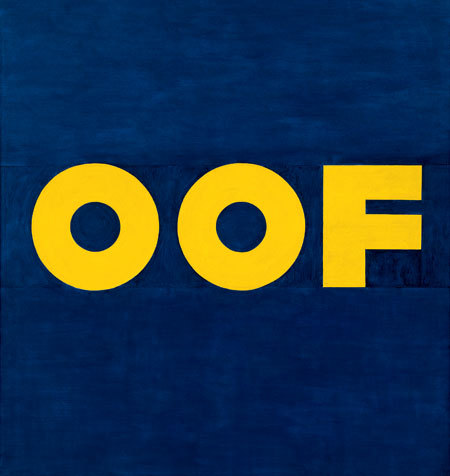
Edward Ruscha is known mostly for his Pop Art. His works are simple, but very concise. He uses bright and vivid colors in his paintings and in some, uses typography. Using just one simple word like Scream or Oof, he creates a concise image with a strong, straightforward message. Ruscha’s art works are simple, but very powerful like when people say, “a picture is worth a thousand words.”
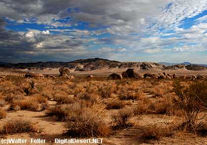
When I started this research, I first focused mostly on the lateral research of Edward Ruscha’s influences.  Many of his artistic influences came from Southern California, Hollywood, and automobile and the road. He was also influenced by Jack Kerouac, Arthur Dove, and Jasper John (Reference).
While researching about one of Ruscha’s influences, Jack Kerouac, I noticed that Kerouac was a writer and not an artist which increased my curiosity of how he influenced Ruscha. After reading about one of Kerouac’s books called On the Road, everything pieced in together.  In one of Ruscha’s interviews, he talked about his road trips and hitchhiking experiences, where he observed the Southern California landscapes and buildings like the gas stations (Reference).  Ruscha then transferred his observations from his road trip experiences into art like the Twentysix Gasoline Stations and Hollywood.
Ruscha’s influences of Southern California landscape had many influences on the Hollywood film industry. The common signs and logos such as the Hollywood sign and the mountains from the paramount pictures were all designs by Ruscha. As an artist from the Pop Art movement, he used bright and vivid colors for these, capturing the audience’s attention and also used typography in perspective, giving the audience a straightforward message.
Another influence of Ed Ruscha was Jasper Johns, especially his painting Target with Four Faces. The art work is a combination of a painting of concentric circles that make an image of a target, and a wooden sculpture of four cropped, eyeless faces. The bold colors of red, yellow, and blue that Johns used for his target reminded me of Ruscha’s paintings because just like Jasper John, Ruscha uses many bright and bold colors for his paintings.
One of the things that I found the most interesting in this research project was the Black Dahlia Case. In one of Ruscha’s interviews, Ruscha was asked if he reads any L.A. writers and he answered James Elroy. After doing some lateral research about Elroy, I learned that he was a crime fiction writer who wrote the book The Black Dahlia. Then my research narrowed down to the Black Dahlia murder case, where a pretty young woman named Elizabeth Short was murdered, cut in half. Though this particular murder case didn’t have much influence in Ruscha’s art works, James Elroy’s writing about the different scenery in Los Angeles could have had some influence on Ruscha.  
Edward Ruscha is one of America’s greatest Pop Art artists. His art was mostly influenced by the landscapes of California. Ruscha’s art works are bright, simple, concise, and straightforward with a strong message. Hollywood’s famous logos and signs were designed by Ruscha, which shows how Ruscha not only plays a big role in the Pop Art Movement, but also in the film industry in Hollywood as well. Looking at Ruscha's works, one can see what he has experienced in his life time, his unique thoughts, and interests. His works may be simple, but they are very powerful.

Typography

Ruscha's Typography Work Examples
    

Definition of TYPOGRAPHY
1
: letterpress printing
2
: the style, arrangement, or appearance of typeset matter

Mojave Desert


The transition from the hot Sonoran Desert to the cooler and higher Great Basin is called the Mojave Desert. This arid region of southeastern California and portions of Nevada, Arizona and Utah, occupies more than 25,000 square miles.

Situated between the Great Basin Desert to the north and the Sonoran to the south (mainly between 34 and 38°N latitudes), the Mojave, a rainshadow desert, is defined by a combination of latitude, elevation, geology, and indicator plants.

Elevations are generally between three and six thousand feet, although Death Valley National Park includes both 11,049-foot Telescope Peak and the lowest point in the United States 282 feet below sea level at Badwater.

Temperatures are a function of both latitude and altitude. Although the Mojave Desert has the lowest absolute elevation and the highest maximum temperature (134°F in Death Valley), it is north of the Sonoran Desert and its average elevations are higher. As a result, its average temperatures are lower than those of the Sonoran.


The Mojave has a typical mountain-and-basin topography with sparse vegetation. Sand and gravel basins drain to central salt flats from which borax, potash and salt are extracted. Silver, tungsten, gold and iron deposits are worked.

While some do not consider the Mojave a desert in its own right, the Mojave Desert hosts about 200 endemic plant species found in neither of the adjacent deserts.Cactus are usually restricted to the coarse soils of bajadas. Mojave Yucca and, at higher elevations Desert Spanish Bayonet, a narrow-leafed yucca, are prominent. Creosote Bush, Shadscale, Big Sagebrush, Bladder-sage, bursages and Blackbush are common shrubs of the Mojave Desert.

Occasional Catclaws grow along arroyos. But, unlike the Sonoran Desert, trees are few, both in numbers and diversity. The exception is the Joshua-tree. While this unusual tree-like yucca is usually considered the prime indicator of Mojave Desert vegetation, it occurs only at higher elevations in this desert and only in this desert.

The Tempest

Click!
The Tempest, by Giorgione

It was already in 1530 described simply as "the little landscape on canvas with a tempest, a gypsy woman and a soldier..."
 
This painting, the meaning of which has been greatly debated, marks a moment of capital importance in the renovation of the Venetian style painting, and perhaps is the most representative of the very few genuine surviving works of Giorgione.
 
The vigour of cultural life at the beginning of the sixteenth century provided exactly the right fertile ground for the personality of Giorgione. With Giovanni Bellini and Vittore Carpaccio as examples in his early training and with his attentive interest in Northern European painting of Belgium he soon decided to attempt a naturalistic language. Colour attains to new all-important powers of expression of the poetic equivalence of man and nature in a single, fearful apprehension of the cosmos. The finest of all expressions of this new vision of the world is the 'Tempest', commissioned from the artist by Gabriele Vendramin, one of the leading lights in intellectual circles in the Venice of the day, in whose house the picture was recorded as having been hung by Marcantonio Michiel in 1530.
 
Though many interpretations of the subject of this small painting have been suggested, none of them is totally convincing. Thus the mystery remains of what exactly the significance is of the fascinating landscape caught at this particular atmospheric moment, the breaking of a storm. Anxious waiting seems to characterize the mood of both the human figures, absorbed in private reveries, and every other detail, from the little town half-hidden behind the luxuriant vegetation and the lazy, tortuous course of the stream to the ancient ruins, the houses, the towers and the buildings in the distance which pale against the blue of the sky. The fascination of the painting arises from the pictorial realization of the illustrative elements. In the vibrant brightness which immediately precedes the breaking of the storm the chromatic values follow one another in fluid gradations achieved by the modulation of the tones in the fused dialectic of light and shadow in an airy perspective of atmospheric value within a definite space. Completely liberated from any subjection to drawing or perspective, colour is the dominant value in a new spacial-atmospheric synthesis which is fundamental to the art of painting in its modern sense.

Source

The 20th Century Fox

The Formation of Twentieth Century-Fox


The 20th Century Fox logo by Ed Ruscha

The modern day media titan known as Twentieth Century-Fox was formed out of the 1935 merger of two important film companies. One was the Fox Film Corporation that had its roots in William Fox's independent exchange that opposed Edison's Motion Picture Patents monopoly in 1909. The other major company was briefly one of the most prominent and promising independent production companies of all time — Twentieth Century-Fox.

Joseph Schenck, the president of United Artists, cofounded Twentieth Century Pictures with Darryl F. Zanuck, former head of production at the Warner Bros. studio. Twentieth Century Pictures was organized in April 1933 as a showcase for the talented 30-year-old producer who resigned from Warners after a salary dispute earlier that year. Zanuck turned down several lucrative offers from other studios in order to devote his efforts to producing quality movies on an independent basis. Twentieth Century signed a distribution deal with United Artists in July 1933, and quickly became the most prolific supplier of films for the distributor.

Unfortunately the new independent took a detour straight into the major studio camp when Zanuck became outraged by United Artists' refusal to reward Twentieth Century with UA stock. Schenck, who had been a UA stockholder for over ten years, resigned from United Artists in protest of the shoddy treatment of Twentieth Century, and Zanuck began discussions with other distributors.

In May 1935, when Sidney Kent at Fox Film asked the independent producer to lead the ailing Fox studio, Twentieth Century Pictures and Fox Film merged. The independent company, barely two years old, received top billing; Kent remained president, Schenck became chairman, and Zanuck found himself head-of-production of the new Hollywood powerhouse—the Twentieth Century-Fox Film Corporation.

Even though Twentieth Century, one of the most high-profile independent companies, had abandoned the independent movement, Darryl Zanuck's initial step of leaving Warners to form his own company had a trigger effect on other studio executives and creative personnel who desired to go independent. David O. Selznick and Walter Wanger, both of whom had considerable production experience at the two preeminent movie factories Paramount and MGM, became independent producers. Walter Wanger left his production unit at MGM in 1934. The following year David O. Selznick did the same with the formation of Selznick International Pictures.

Source | Picture Source