October 13, 2011

Ferus Gallery- The Cool School

The Flim

"I remember the word 'Ferus' outside had this kind of magic to it. Ferus had a much sparer approach to showing art. If you want to put a tiny painting on a single big wall, you're welcome to it. And the artist is the boss."
—Ed Ruscha, Ferus Gallery artist

How do you build an art scene from scratch—and not lose your soul in the process? THE COOL SCHOOL is the story of the Ferus Gallery, which nurtured Los Angeles’s first significant post-war artists between 1957 and 1966.
In late 1956, medical-school dropout Walter Hopps met artist Ed Kienholz for lunch at a hot dog stand on La Cienega Boulevard. The two drafted a contract on a hot dog wrapper that stated simply, “We will be partners in art for five years.” And with that, the Ferus Gallery was born.
Operating out of a small storefront, the gallery hosted debut exhibitions and served as a general launching point for Ed Kienholz, Ed Ruscha, Craig Kauffman, Wallace Berman, Ed Moses and Robert Irwin, among many other artists. By the time it closed in 1966, the gallery had also played a role in solidifying the careers of many of New York’s brightest talents, including Roy Lichtenstein, Andy Warhol, Donald Judd, Frank Stella, Robert Rauschenberg and Jasper Johns.
First under the leadership of genius autodidact Walter Hopps, then the smooth-as-silk Irving Blum, Ferus groomed the Los Angeles art world from a loose band of idealistic beatniks into a coterie of competitive, often brilliant artists. What was lost and what was gained was tied up in a complicated web of egos, passions, money, interpersonal relationships and artistic statements.
The gallery’s eventual success came at a cost. The closing of Ferus, just as it was finally becoming financially solvent, is indicative of the volatile and complex relationship money invariably has with art. But while Ferus had a polarizing effect on artists, ideas and art, the gallery managed to do for art in Los Angeles what the museums previously could not. Even though their modalities were as disparate as assemblage art, abstract expressionism and Pop, Ferus artists shared ideas, goals, workspaces and a lasting vision.

Source

Hitchhike

Definition of HITCHHIKE
 
intransitive verb
1
: to travel by securing free rides from passing vehicles
2
: to be carried or transported by chance or unintentionally <destructive insects hitchhiking on ships>
transitive verb
: to solicit and obtain (a free ride) especially in a passing vehicle
hitch·hik·er noun

Oklahoma City

Oklahoma City Geography


Photograph Source

According to the United States Census Bureau, the city has a total area of 621.2 square miles (1,608.8 km2), of which, 607.0 square miles (1,572.1 km2) of it is land and 14.2 square miles (36.7 km2) of it is water. The total area is 2.28% water. Oklahoma City is located in the Frontier Country region of Central Oklahoma, in the Southern Plains of North America; it is on the tallgrass and mixed-grass prairie section of the Great Plains.
Most of the area consists of gently rolling hills, covered in places by stands of dense, low trees, along with shrubs and many varieties of prairie grasses and wildflowers. Those woodlands, mostly to the north and east of the metropolitan area, are known as the Cross Timbers. They consist of blackjack oak (Quercus marilandica), post oak (Q. stellata), hickory (Carya spp.), and other plant species which become more widespread in the southeastern forests, about 100 miles (160 km) east of the Oklahoma City metropolitan area.
The city is roughly bisected by the North Canadian River (recently renamed the Oklahoma River inside city limits). The North Canadian was once substantial enough to flood every year, wreaking destruction on surrounding areas, including the original Oklahoma City Zoo. In the 1940s the Civilian Conservation Corps built a dam on the river, which reduced its flow for the next 50 years.  In the 1990s, as part of the citywide revitalization project known as MAPS, the city built a series of low-water dams, returning water to the portion of the river flowing near downtown.  The city also has three large lakes: Lake Hefner and Lake Overholser, in the northwestern quarter of the city; and the largest, Lake Stanley Draper, in the sparsely populated far southeast of the city.
The population density normally reported for the city using area of its city limits can be a bit misleading, as its urbanized zone covers roughly 244 sq mi (630 km2), compared with the rural areas incorporated by the city, which cover the remaining 377 sq mi (980 km2) of the city limits.
Oklahoma City is the second largest city in the nation in compliance with the Clean Air Act (after Jacksonville, Florida).

Source

Chouinard Art Institute

CalArts is internationally renowned as one of the leading centers for undergraduate and graduate study in the performing and visual arts and in the critical study of these arts.
It was the nation's first art institute to offer BFAs and MFAs in both the visual and performing arts, and today the Institute remains dedicated to training and nurturing the next generation of professional artists, fostering brilliance and innovation within the broadest context possible. Admission to CalArts is competitive and considered mainly on the basis of demonstrated talent, creativity and commitment. Other important considerations include educational records, recommendations, and artist's statement.
To encourage innovation and experimentation, CalArts' six schools—Art, Critical Studies, Dance, Film/Video, Music and Theater—are all housed under one roof in a unique, five-story building with the equivalent of 11 acres of square footage in Valencia, California, just 30 minutes north of downtown Los Angeles.

Source

Pop Art

What is Pop-Art? - Characteristics
The term Pop-Art was invented by British curator Lawrence Alloway in 1955, to describe a new form of "Popular" art - a movement characterized by the imagery of consumerism and popular culture. Pop-Art emerged in both New York and London during the mid-1950s and became the dominant avant-garde style until the late 1960s. Characterized by bold, simple, everyday imagery, and vibrant block colours, it was interesting to look at and had a modern "hip" feel. The bright colour schemes also enabled this form of avant-garde art to emphasise certain elements in contemporary culture, and helped to narrow the divide between the commercial arts and the fine arts. It was the first Post-Modernist movement (where medium is as important as the message) as well as the first school of art to reflect the power of film and television, from which many of its most famous images acquired their celebrity. Common sources of Pop iconography were advertisements, consumer product packaging, photos of film-stars, pop-stars and other celebrities, and comic strips.


Source

October 12, 2011

Ruscha's Works

rusch hollywood3 ED RUSCHA
Ed is the art world’s version of a celebrity. In the 1970s he directed two short films: the very witty “Premium” and “Miracle”… the story about a curious day in the life of an auto mechanic. Ruscha has even given acting a shot. He played a radio station director in the film Choose Me. Movie industry heavyweights Jack Nicholson, Steve Martin and Dennis Hopper have Ruscha originals on their walls. Mick Jagger hangs out in Ed’s studio. Ruscha’s iconic paintings of the Hollywood sign are emblematic of his own fame. It’s propped up, paper-like and it’s aligned in the same respect as much of Ed’s work. But the only reason he painted it in the first place is because it was staring at him out the back window. “I had to do it because it was there,” he quips. Ruscha’s California catalogue is extensive and important. His paintings have mapped, plotted and given perspective to L.A. streets and sections. His numerous photography books about palm trees, swimming pools, parking lots and apartment complexes in Los Angeles established him as a conceptual leader in the industry. Then & Now shows the evolution of Hollywood Boulevard from 1973 to 2004 and looks at change the way an anthropologist would. He took pictures of every building on the Sunset Strip and turned it into an accordion book. “I like the idea of patching it all together and making a single picture out of it, almost like a ribbon or a strip of something,” Ruscha says. “That’s why I always appreciate a roll of toilet paper. It all hangs together and yet it’s all a part of one thing.”

Sometimes he admits he wants to flush Los Angeles down the ole commode. It’s a love-hate thing where the pendulum swings back and forth between the fascination and the frustration of living in such a big and diverse city. Similarly, the choice to set up shop in sunny SoCal has been a blessing and a curse for his career. “There’s no artist associated with the sixties and Los Angeles who better epitomizes Hollywood in the visual art world than Ed Ruscha,” according to Paul Schimmel, Chief Curator at the Museum of Contemporary Art Los Angeles. “It’s central and in some ways a detriment to a broader understanding of the complexities of his work. For many, up until recently, he was the Hollywood pop artist. Pop art and the myth of Hollywood trapped people’s understanding of who Ed Ruscha is.”
Ruscha was thumbing through the pages of a magazine when he saw a tiny reprint of Jasper Johns’ Target With Four Faces. The painting was premeditated and symmetrical and Ed was floored. “It just went counter to everything that people were talking about in school. It was not just a target. It had faces. It was something immediately recognizable coupled together with something that was totally mysterious.” Robert Rauschenberg’s “combine paintings” gave Ed that same kind of hope. “I began to see that there were some artists who were doing something that perplexed me and moved me towards a career in fine art.” With a newfound purpose, Ruscha began sticking fabric and parts of comic strips on his canvases. He also began experimenting with words and painting common objects like pencils and school supplies. The representational shift quickly turned to popular subject matter, and Ruscha soon found himself riding the initial wave of American pop art.


At eleven feet wide, Ruscha’s Large Trademark with Eight Spotlights is a major statement about the relevance and importance of the movie industry in pop culture. The 20th Century Fox commercial logo flies onto the screen and boldly announces the beginning of a motion picture. Ed wanted his art to provide that same kind of experience. “I always liked as a kid watching movies where there’d be an empty landscape and you’d hear a train coming, but you didn’t see it. Then way in the far right hand corner you’d see this train. Within seconds it was filling the screen going from lower right to upper left. Well the 20th Century Fox logo is doing the same thing. It opened up an avenue in my mind to create pictures along these lines.”

Source
Picture Source

Word Paintings

Ed Ruscha: A man of his words


The Hayward Gallery's retrospective of the American pop artist Ed Ruscha reveals an enigmatic marriage of text and image. Tom Lubbock attempts to spell it all out
Tuesday, 13 October 2009


There's a picture by the Renaissance Venetian artist Giorgione called The Tempest. It's famous for being baffling. It shows a landscape and a town, a flash of lightning in the sky, two isolated pillars, a soldier, a naked woman and a baby – an all too meaningful ensemble. But what on earth does it mean? A story? An allegory? Art historians have wondered, and no answer has been found.
It's hard to know even what the problem is. Perhaps the meaning was perfectly clear once, but now it eludes us. Perhaps there was never a meaning, only a dreamy poetical scene. And there are other possibles. It could be a puzzle picture, with clues to be deciphered. It could be a trick, a pseudo-puzzle with no solution, designed to waste your time. It could be a conscious tease, which asks to be enjoyed precisely for its brilliantly constructed mysteriousness.
Though remote in many ways, The Tempest reminds me of Ed Ruscha's art. This West Coast painter is a master of mystery. To use that notorious phrase, his work is full of unknown unknowns. Take his picture from 1998 entitled The Mountain. It shows, unsurprisingly, a rising snowy peak. But then, superimposed on this view, is a word, three letters, upper case: the. The?
And at once, you're puzzling. You might say, well here are two ways of saying the same thing: one verbal, as in the title, one verbal-plus-visual, as in the painting. The. Mountain. But the way the letters are superimposed makes the the look more like a definition of the mountain, or as if the mountain was the very essence of The-ness. And see how the t on the the is much bigger than the other letters. Something deeply odd is going on between word and image. What does it all mean?
Ruscha – incidentally, you pronounce it Roo-shay – is in his early seventies. About 50 years of his work can be seen at the Hayward Gallery, 50 years of carefully composed enigmas. It begins with words.
Around 1960, many American painters were looking for a way out of pure abstraction. Ruscha took the way of letters. He painted words, often single words, drawing inspiration specifically from public lettering – from shop fronts and signboards, and product advertising with its trademark type-faces. There are pictures with bold and punchy logos: war surplus, boss or oof. There are pictures based on the 20th Century Fox emblem and the Hollywood sign on the Hollywood Hills.
In these word paintings, words don't perform as they normally do. They don't communicate. They go dumb. It's like that odd speech phenomenon, technically called "semantic satiation" or "semantic saturation", which happens when a word or phrase is repeated so much that it loses its meaning, and becomes just an empty sound. That's what Ruscha's early paintings do to the printed word. Their letters become semantically null, just a formation of cut-out coloured shapes.
Or rather (and this is the tantalizing thing) the words don't become totally abstract. They don't forget their sense entirely. Rather, they do and they don't. This is why "semantic satiation" – printed or spoken – feels so weird. It hovers between the meaningful and the unmeaningful. And that is an ambiguity you find throughout Ruscha's work.
But the next two decades were not so productive. It's as if he'd got his essential idea, but hadn't found ways to bring it out. Ruscha played games with words, some of them silly (the word boss again, but with the letters squeezed by vices), some very laconic (the phrase sand in the vaseline painted gold in grey). He introduced images too, and found a way to make them feel semi-meaningless, as he had with words.
The trick with images is to paint some object (pills, a building) in a rather precise and illustrational manner – but to set it, in isolation, against a blurry and almost blank background. It puts the object in quotations. You see it as an opaque piece of painting. You don't see through it, to the thing that it depicts. Or rather, again, you do and you don't.
Then, in the early 1980s, Ruscha devised what became his signature device: words floating over a view. You might say this device was borrowed from magazine ads or book covers or title sequences of films, except the paintings don't look much like any of these. Their words often use Ruscha's personal typeface, a clunky, curve- free font (the O is an octagon). And the relationships between the words and the views behind – well – they're absolutely gnomic.
not a bad world is it? floats over a kitschy sunset landscape, that looks like a vision of heaven from a Jehovah Witness leaflet. Meanwhile, over a cityscape at night, with its grid of lit streets, talk radio is sharply written in neon. And then american tool supply is superimposed on a picture postcard snowy mountain range. Or sometimes it's not words but an object that takes the foreground. Five Past Eleven shows a very large close-up section of an old Roman-numeral clock-face; floating over it, a very fine length of bamboo cane.
What connects these juxtapositions? Irony, surrealism, specialist history, a private memory? Who knows? And Ruscha has other tricks of obscurity. His phrases are plucked from some unimaginable context, like the charming faster than a speeding beanstalk. Figures are shown in such blurred silhouette that they almost retreat into invisibility (see the magnificent coyote in Howl), or likewise in a dazzling glare. Cartoon caption boxes appear, but with no words in them. They all go into the mix.
You might think of the game of word-non-association. Each player has to say a word in turn, and it must have nothing to do with the word said by the last. It's strangely difficult. Words have their gravitation. Ruscha is like an expert player of this game – but with this refinement, that each time he seems to have fallen into an association, yet when you try to work out where the association is, you can't.
That's how his pictures work. They're painted so clearly, and they seem to add up so clearly, that you smile. It's obvious. But when you try to put your finger on it, the meaning eludes you, just, but completely. I'd especially recommend (though I couldn't get it across) the picture called Oldsmobile. There's a meaning there, surely, but utterly out of your grasp.
And along with this elusiveness, and stranger still, there are open hints of the transcendental. True, it's not Ruscha's only subject. His images and words refer to industry, city life, the big highway. But there's enough to make you wonder. There's the ghostliness of his blurs, the blaze of illuminations. There are the soaring mountains and the heavenly clouds. There's the explicit religiosity in his words: 90% angel 10% devil, a particular kind of heaven, hell heaven, sin. Perhaps the strangest image here is words without thoughts never to heaven go, arranged in a neon ring against darkness, the words diminishing as they go round. It's from Hamlet, Claudius trying hopelessly to pray.
So the final enigma of Ruscha's enigma variations is where their mystery stands. Is this art, with all its ungraspable beyonds, a kind of religious art? It presents us with appearances and signs. It asks whether there's something or nothing behind its words and its images. His hieroglyphic images constantly provoke and defeat our attempts at interpretation. Are they blank, empty facades? Or do they imply sublime inarticulable depths? Don't worry, you'll never know.

 Source

Interview

Artist Ed Ruscha on His Greatest Influence

May 2011 Issue

For more than half a century, Los Angeles artist Ed Ruscha has been decoding the American landscape, creating iconic images of strip malls, apartment buildings, and gas stations. His early adventures on asphalt, and the work they inspired, are documented in the new book Road Tested (Hatje Cantz, $40). Here, he explains how these travels honed his vision and how the highway has changed since then.

DETAILS: How is it different to drive across the landscape today from how it was 50 years ago?

Ed Ruscha: The one thing I miss is hitchhiking. Now there's no more of that. When's the last time you saw a hitchhiker? It's not that I consider it a great sport, but it was my way of seeing the country. The open road, especially in the western United States, is still very pristine, but everything else around it has changed. The highways are bigger and wider and faster and more developed than they ever were, and that's never going to stop.

DETAILS: When you started hitchhiking, were you thinking it would provide material for your art?

Ed Ruscha: I just wanted to get from one place to another. I had a friend in Oklahoma who had this idea to go hitchhiking, and my folks were okay with it. I had no idea what to expect. I just remember that it took 26 rides to get from Oklahoma to Florida and then it took exactly 26 rides to get back. I didn't particularly relish meeting new people, but that's what happened, and I feel fortunate that I didn't meet any weirdos, so I was able to see the landscape without interference. I barely knew I wanted to be an artist. I liked my art classes and painting was fun, I guess, but I didn't realize that seeing the country was going to inspire me to further explore that … but that's what it did.

DETAILS: When you did decide to become an artist, did you deliberately try to document "Americana"?

Ed Ruscha: Well, at an early age I had to go see Europe. I had notions about it, mostly through American movies. Then I got there and it was all really new and unique to me, but I still craved American things. I wasn't captivated by the romance of Paris or London. I love visiting, but I'd rather be in L.A.

DETAILS: You've always paid attention to signage in your art. How has that changed? Is a Subway restaurant sign as intriguing to you as a Standard Oil sign?

Ed Ruscha: I didn't necessarily want more of it, but what I saw was inspirational—especially things that weren't corporate, things that were done by hand. You never see that anymore. That's a culture that's washed out and gone, and now we have plastic letters and that sort of thing. But it's all visual noise, and it's the lifeblood of the culture we're in.

DETAILS: You were close with Dennis Hopper. Do you have any thoughts on his passing?

Ed Ruscha: I just took down a painting here in the studio that I did of the word if. Dennis would come by here and sometimes bring friends with him. He would look up at that painting and immediately begin reciting Rudyard Kipling's poem "If." He would do it flawlessly, because he did these things in the theater in San Diego. I remember that with fondness, because he was a good friend and one of the first people to collect my art back in the early sixties. Just to see him go through his roller-coaster life was a wake-up call for—something. I'm not sure what! [Laughs]

Source

Biography

Edward Joseph Ruscha IV (born December 16, 1937) is an American artist associated with the Pop art movement. He has worked in the media of painting, printmaking, drawing, photography, and film. Ruscha lives and works in Venice, California and in Yucca Valley, Mojave Desert.

Ruscha was born into a Roman Catholic family in Omaha, Nebraska, with a younger sister, Shelby, and a younger brother, Paul. Edward Ruscha, Sr. was an auditor for Hartford Insurance Company. Ruscha's mother was supportive of her son's early signs of artistic skill and interests. Young Ruscha was attracted to cartooning and would sustain this interest throughout his adolescent years. Though born in Nebraska, Ruscha lived some 15 years in Oklahoma City before moving to Los Angeles in 1956 where he studied at the Chouinard Art Institute (now known as the California Institute of the Arts) under Robert Irwin and Emerson Woelffer from 1956 through 1960. Ruscha spent much of the summer of 1961 traveling through Europe. After graduation, Ruscha took a job as a layout artist for the Carson-Roberts Advertising Agency in Los Angeles. He was married to Danna Knego from 1967 to 1972.

By the early 1960s he was well known for his paintings, collages, and photographs, and for his association with the Ferus Gallery group, which also included artists Robert Irwin, John Altoon, John McCracken, Larry Bell, Ken Price, and Edward Kienholz. He worked as layout designer for Artforum magazine under the pseudonym "Eddie Russia" from 1965 to 1969 and taught at UCLA as a visiting professor for printing and drawing in 1969. He is also a life-long friend of guitarist Mason Williams.

He has two children, Edward "Eddie" Ruscha Jr. and Sonny Bjornson.

He achieved recognition for paintings incorporating words and phrases and for his many photographic books, all influenced by the deadpan irreverence of the Pop Art movement. Ruscha's textual, flat paintings have been linked with both the Pop Art movement and the beat generation.

While in school in 1957, Ruscha chanced upon then unknown Jasper Johns' Target with Four Faces in the magazine Print and was greatly moved. Ruscha has credited these artists' work as sources of inspiration for his change of interest from graphic arts to painting. He was also impacted by Arthur Dove's 1925 painting Goin' Fishin', Alvin Lustig's cover illustrations for New Directions Press, and much of Marcel Duchamp's work. In a 1961 tour of Europe, Ruscha came upon more works by Johns and Robert Rauschenberg, R. A. Bertelli's Head of Mussolini, and Ophelia by Sir John Everett Millais. Some critics are quick to see the influence of Edward Hopper's "Gas" in Ruscha's 1963 oil painting, "Standard Station, Amarillo, Texas." In any case, "Art has to be something that makes you scratch your head," Ruscha said.

Although Ruscha denies this in interviews, the vernacular of Los Angeles and Southern California landscapes contributes to the themes and styles central to much of Ruscha's paintings, drawings, and books. Examples of this include the book Every Building on the Sunset Strip, a book of continuous photographs of a two and one half mile stretch of the 24 mile boulevard. Also, paintings like Standard Station, Large Trademark, and Hollywood exemplify Ruscha's kinship with the Southern California visual language. Two of these paintings, Standard and Large Trademark were emulated out of car parts in 2008 by Brazilian photographer Vik Muniz as a commentary on Los Angeles and its car culture.

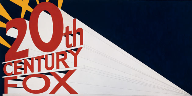
His work is also strongly influenced by the Hollywood film industry: the mountain in his Mountain Series is a play on the Paramount Pictures logo; Large Trademark with Eight Spotlights depicts the 20th Century Fox logo, while the dimensions of this work are reminiscent of a movie screen; in his painting The End these two words, which comprised the final shot in all black and white films, are surrounded by scratches and streaks reminiscent of damaged celluloid.

Ruscha completed Large Trademark with Eight Spotlights in 1961, one year after graduating from college. Among his first paintings (Su, Sweetwater, Vicksburg) this is the most widely known, and exemplifies Ruscha's interests in popular culture, word depictions, and commercial graphics that would continue to inform his work throughout his career. Large Trademark was quickly followed by Standard Station and Wonder Bread. In Norm's, La Cienega, on Fire (1964), Burning Gas Station (1965-66), and Los Angeles County Museum of Art on Fire (1965-68), Ruscha brought flames into play. In 1966, Ruscha reproduced Standard Station in a silkscreen print using a split-fountain printing technique, introducing a gradation of tone in the background of the print.

The very first of Ed Ruscha's word paintings were created in Paris in 1961. Since 1964, Ruscha has been experimenting regularly with painting and drawing words and phrases, often oddly comic and satirical sayings alluding to popular culture and life in LA. When asked where he got his inspiration for his paintings, Ruscha responded, "Well, they just occur to me; sometimes people say them and I write down and then I paint them. Sometimes I use a dictionary." From 1966 to 1969, Ruscha painted his "liquid word" paintings: Words such as Adios (1967), Steel (1967-9) and Desire (1969) were written as if with liquid spilled, dribbled or sprayed over a flat monochromatic surface. His gunpowder and graphite drawings (made during a period of self-imposed exile from painting from 1967 to 1970) feature single words depicted in a trompe l'oeil technique, as if the words are formed from ribbons of curling paper. In the 1970s, Ruscha, with Barbara Kruger and Jenny Holzer, among others, began using entire phrases in his works, thereby making it a distinctive characteristic of the post-Pop Art generation. In the early 1980s he produced a series of paintings of words over sunsets, night skies and wheat fields. Later, words appeared on a photorealist mountain-range series which Ruscha started producing in 1998.

From 1980, Ruscha started using an all-caps typeface of his own invention named "Boy Scout Utility Modern".

In his drawings, prints, and paintings throughout the 1970s, Ruscha experimented with a range of materials including gunpowder, vinyl, blood, red wine, fruit and vegetable juices, axle grease, and grass stains. Stains, an editioned portfolio of 75 stained sheets of paper produced and published by Ruscha in 1969, bears the traces of a variety of materials and fluids. Ruscha has also produced his word paintings with food products on moire and silks, since they were more stain-absorbent.

In the 1980s, a more subtle motif began to appear, again in a series of drawings, some incorporating dried vegetable pigments: a mysterious patch of light cast by an unseen window that serves as background for phrases such as WONDER SICKNESS and 99% DEVIL, 1% ANGEL. By the 1990s, Ruscha was creating larger paintings of light projected into empty rooms, some with ironic titles such as An Exhibition of Gasoline Powered Engines (1993).

Ruscha's first major public commissions include murals at the the Museum of Contemporary Art, San Diego, in 1966 and the Great Hall of Denver Public Library in Colorado. In 1985 Ruscha was commissioned to design a series of fifty murals for the rotunda of Miami-Dade Public Library (now the Miami Art Museum) in Florida, designed by architects Philip Johnson and John Burgee.

In 1998, Ruscha was commissioned to produce a large painting. PICTURE WITHOUT WORDS, for the lobby of the Harold M. Williams Auditorium of the Getty Center. The artist was later commissioned by the M. H. de Young Memorial Museum to create two large-scale paintings that flank his A Particular Kind of Heaven (1983), which is in the museum's collection, to form a spectacular, monumental triptych. In 2008, he was among four text-based artists that were asked by the Whitechapel Gallery to write scripts to be performed by leading actors; Ruscha's contribution was Public Notice (2007). To celebrate the San Francisco Museum of Modern Art (SFMOMA)'s 75th anniversary, Ruscha was one of the artists invited to collaborate with the museum a limited-edition artist-designed T-shirt. Ruscha is regularly commissioned with works for private persons, among them James Frey (Public Stoning, 2007), Lauren Hutton (Boy Meets Girl , 1987), and Stella McCartney (Stella). In 1987, collector Frederick Weisman commissioned Ruscha to paint the exterior of his private plane, a Lockheed JetStar.
Source

October 8, 2011

Introduction- Midterm

Edward Ruscha is an American artist mostly known for his Pop Art. Ruscha was born in Omaha, Nebraska on December 16, 1937. He grew up in Oklahoma City and moved to Los Angeles to attend the Chouinard Art Institute. He built his experiences as an artist by associating with the Ferus Gallery group, working for the Artforum magazine, and teaching at UCLA. He has worked in various media of painting, printmaking, drawing, photography, and film.

Many of Ruscha’s works are simple, but to the point. As an artist from the Pop Art Movement, he uses bright and vivid colors in his painting as well as the use of typography. In his paintings, such as Scream and Oof, he combines the bright colors of Pop Art and typography to create a concise image with a straightforward message. Ruscha’s art works are simple, but very powerful .

According to interviews, Ruscha’s artistic influences came from the Southern California landscapes and the lifestyle of California in general, which are the themes for most of his art works. Ruscha converts his experiences and memories in California into art. For an example, in one of his interviews, he mentioned how he used to hitchhike before he was capable of driving. By hitchhiking, he was able to observe the scenery of California, which he later on transferred his observations into his paintings. Besides the influences of California, many artists like Jasper John, Arthur Dove, and Sam Doyle also had a great impact on him.

The common signs and logos in the Hollywood film industry, such as the Hollywood sign, mountains from the paramount pictures, and the twentieth century fox logo, also known as the Large Trademark with Eight Spotlights, are all designs by Edward Ruscha. Of course, Ruscha's influences for those logos are from the Southern Californian landscapes. Ruscha not only plays a big role in the Pop Art Movement, but also in the film industry in Hollywood.

Edward Ruscha plays a big role in the Pop Art Movement, but that is not my reason for choosing him for this research project. First, the simplicity of his works using bright colors caught my attention. They might look like plain texts or images on a bold background, but there is a lot more to it. By looking at Ruscha's works, one can see what he has experienced in his life time, his unique thoughts, and interests. His works may be simple, but they are very effective.